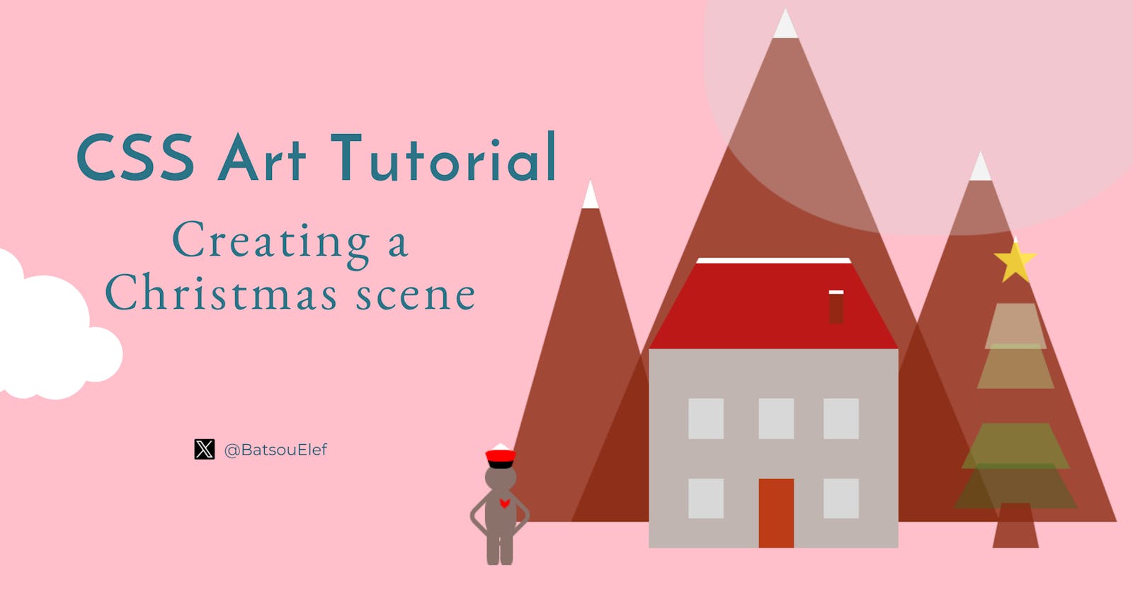
CSS Art Tutorial: Creating a Christmas Scene (and Animating the Mountains and the Tree) 🎄❄️


Introduction
In this article, I'll show you how to create a Christmas scene with snowy mountains, a tree, a little home and a cute human with SCSS+HTML!
Tools and resources:
You'll learn:
How to create different shapes
How to add simple animations
For practice, you can:
- Add more animations
- Add more humans
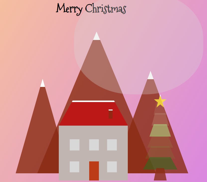
The final result:
The Base and The Mountains
I'll start by creating an invisible box and inside there, I'll have the whole scene.
<body>
     <h1 class="title">Merry Christmas</h1>
     <!-- Invisible Box-->
     <div class="box">

       <!-- mountains -->
       <div class="mountains mountains-1"></div>
       <div class="mountains mountains-2"></div>
       <div class="mountains mountains-3"></div>

    </div>
</body>
The only thing that is outside of the box is the title where I have a Merry Christmas. Since I want a fancy-Chrismacy feeling I'm going to add an extra font-family in the head.
<link href="https://fonts.googleapis.com/css?family=Mountains+of+Christmas"
rel="stylesheet">
We also have a "base-template" for the SCSS.
// Define colors
$background: linear-gradient(120deg, #fccb90 0%, #d57eeb 100%);
$mountains: rgba(137, 43, 17, 0.8);
$roof: #BC1818; //red
$door: #BC3C18; //red-brown
$house: #C1B5B2; //grey
$window: #D8D8D8; //light-grey
$sun: rgba(216, 216, 216, 0.3);
$star: rgba(255, 235, 59, 0.8);
$human: #8A716A; //dark grey

$windowAnimationDuration: 3s;

// Global styles
body {
  background: $background;
  font-family: "Mountains of Christmas";
}

.box {
  position: relative;
  margin: auto;
  width: 630px;
  height: 460px;
  margin-top: 2%;
}
I defined all the colors on the top of my file, as well as some style for the body. I also added some properties I always use for the .box (hence I called it above "base-template").
If you want to see the box you can give it some color but in this case we don't want the color! Also feel free to adjust the width, the height and the margin-top.
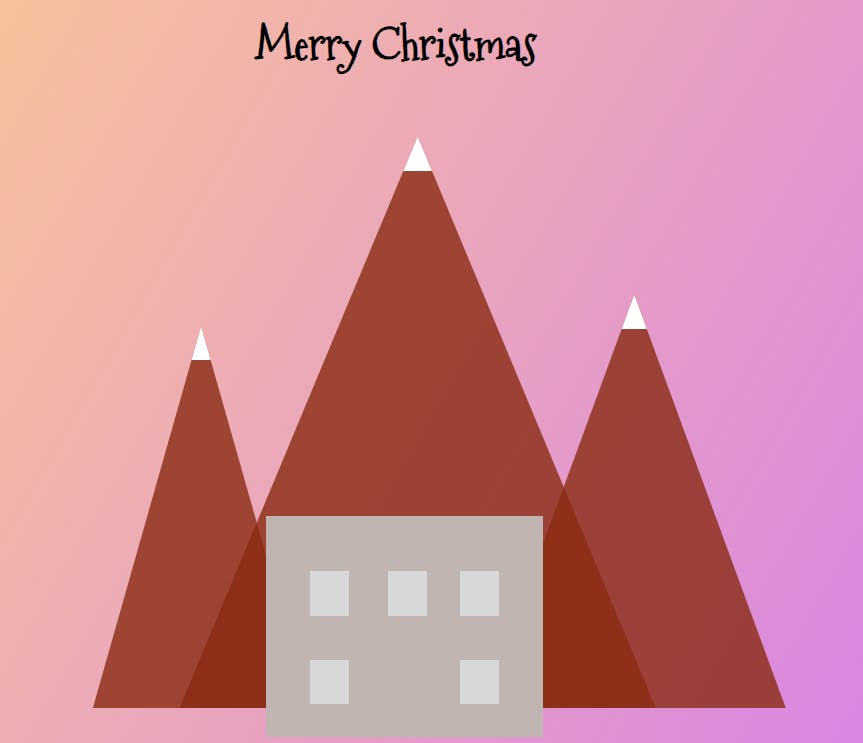
Perfect, now it's time to create the mountains! We have one "main" class (.mountains) and then 3 similar ones (.mountains-1, mountains-2, mountains-3).
// Mountain styles
.mountains {
  position: absolute;
  background: $mountains;
  border-top: 25px solid white;

  // clippy tool
  -webkit-clip-path: polygon(50% 0%, 0% 100%, 100% 100%);
  clip-path: polygon(50% 0%, 0% 100%, 100% 100%);

   // ... (styles for different mountains)
}
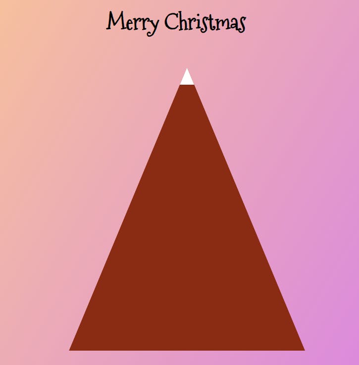
For the .mountains, after defining the position and the background, we'll use the clippy tool to define the shape of the tree, which is basically a triangle...
To see the mountains don't forget to add width and height. For example:
width: 55%;
height: 85%;
The above code should give you this:
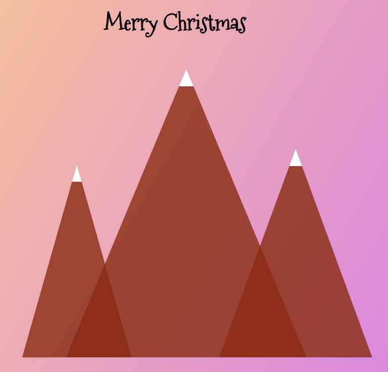
But, since we use SCSS and we want 3 mountains, we can optimize our classes. Here is what we can do:
.mountains{
  position: absolute;
  background: $mountains;
  border-top: 25px solid white;
  // clippy tool
  -webkit-clip-path: polygon(50% 0%, 0% 100%, 100% 100%);
clip-path: polygon(50% 0%, 0% 100%, 100% 100%);

  &.mountains-1{
    top: 5%;
    left: 25%;
    width: 55%;
    height: 85%;
 }
  &.mountains-2{
    top: 35%;
    left: 15%;
    width: 25%;
    height: 55%;
  }
  &.mountains-3{
    top: 30%;
    right: 5%;
    width: 35%;
    height: 60%;
  }
}
Now you should have something like this:
The House (+ Animations on the Windows)
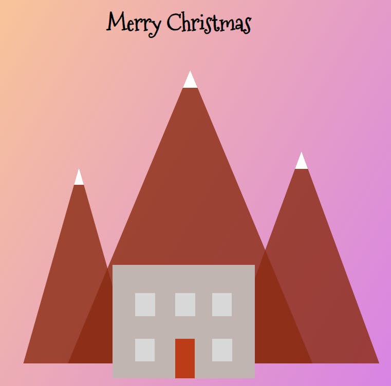
Let's start coding a house with a door, some animation on the windows, a roof, and a chimney. Note, that this code is inside the invisible box we coded above.
   <!-- house -->
   <div class="house">
     <div class="door"></div>
     <div class="window window-1"></div>
     <div class="window window-2"></div>
     <div class="window window-3"></div>
     <div class="window window-4"></div>
     <div class="window window-5"></div>
   </div>
   <div class="roof">
     <div class="chimney"></div>
   </div>
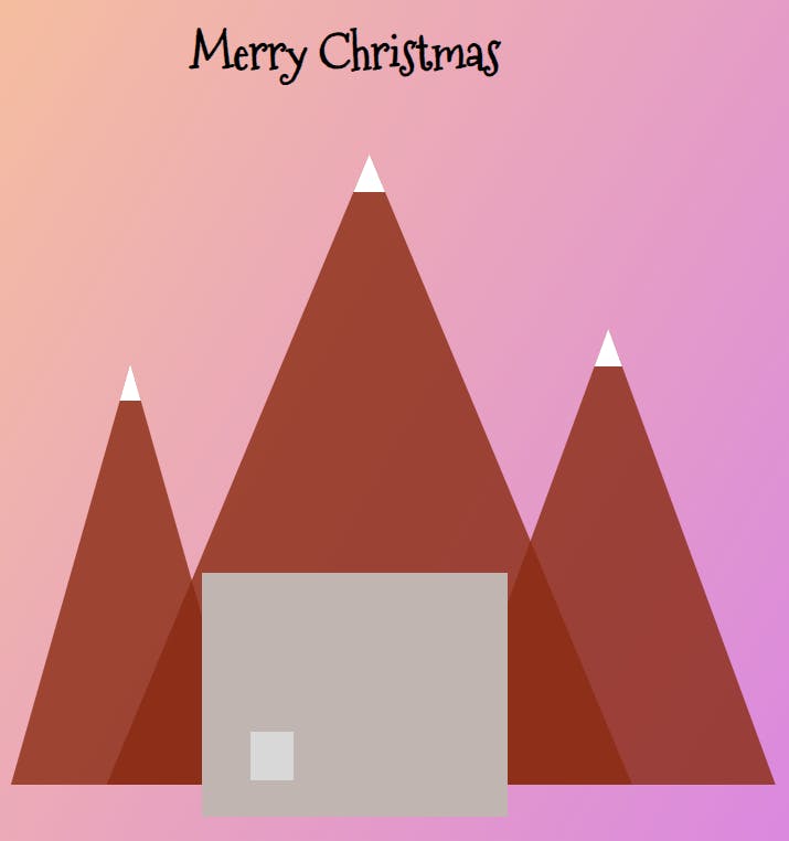
On the SCSS part, the first thing we need is the house.
.house{
  position: absolute;
  top: 65%;
  left: 35%;
  width: 32%;
  height: 35%;
  background: $house;
}
After that, I'll add a window. (We'll use the same technique as above ~ meaning we have a main structure for the window and then window 1 to 5 for the specific properties that will differentiate one window from the other.)
If you want to see one window, you can do:
.window{
  position: absolute;
  width: 14%;
  height: 20%;
  background: $window;

  top: 65%;
  left: 16%;
}
But if you want to see 5 windows, you can optimize your code to something like this:
 .window{
  position: absolute;
  width: 14%;
  height: 20%;
  background: $window;

  &.window-1{
    top: 65%;
    left: 16%;
  }
  &.window-2{
    top: 65%;
    right: 16%;
  }
  &.window-3{
    top: 25%;
    left: 16%;
  }
  &.window-4{
    top: 25%;
    right: 16%;
  }
  &.window-5{
    top: 25%;
    left: 44%;
  }
 }
And accordingly, you'll get:
But hey, we talked about adding animation too, right?! Let's see how we can do this!
Animations for the windows are defined using @keyframes and then applied to individual window elements within the house.
Here is the animation definition:
@keyframes window-1 {
  0%, 100% {
    opacity: 1;
  }
  41.99% {
    opacity: 1;
  }
  // Other opacity keyframes...
}
This animation named window-1 starts and ends with full opacity (opacity: 1). It then manipulates the opacity property at different percentage intervals to create a fading effect for the window. The specific opacity percentages control how the window opacity changes over time, thus creating a fading-in and fading-out effect.
The animation is then applied to the window elements using the -webkit-animation and animation properties, with the window-1 animation name, duration, timing function, delay, and iteration count specified:
&.window-1 {
  // Other styles...
  -webkit-animation: window-1 2s linear 1s infinite both;
  animation: window-1 2s linear 1s infinite both;
}
This code attaches the window-1 animation to the window with the class .window-1. It specifies a duration of 2s, a linear timing function, a 1s delay before starting the animation, and an infinite iteration (infinite) that makes the animation loop continuously. The both keyword ensures that the animation properties affecting the element are applied before and after the animation sequence.
Similar animations (like window-2, window-5, etc.) are defined and applied to other window elements with different durations, delays, and iteration counts to create varied window animation effects.
These animations combine different opacity percentages over time to generate a fading effect, providing a dynamic and engaging visual experience for the window elements in your Christmas scene. Adjusting these percentages or animation properties can modify the speed, timing, and style of the window animations.
You can check the exact code for the animations here, on my Codepen project, but I'd encourage you to experiment on your own too. Below, I've attached only a part of it:
//windows
@-webkit-keyframes window-1 {
  0%,
  100% {
    opacity: 1;
  }
  41.99% {
    opacity: 1;
  }
  42% {
    opacity: 0;
  }
  43% {
    opacity: 0;
  }
  43.01% {
    opacity: 1;
  }
  45.99% {
    opacity: 1;
  }
  46% {
    opacity: 0;
  }
  46.9% {
    opacity: 0;
  }
  46.91% {
    opacity: 1;
  }
  51.99% {
    opacity: 1;
  }
  52% {
    opacity: 0;
  }
  52.8% {
    opacity: 0;
  }
  52.81% {
    opacity: 1;
  }
}
@keyframes window-1 {
  0%,
  100% {
    opacity: 1;
  }
  41.99% {
    opacity: 1;
  }
  42% {
    opacity: 0;
  }
  43% {
    opacity: 0;
  }
  43.01% {
    opacity: 1;
  }
  45.99% {
    opacity: 1;
  }
  46% {
    opacity: 0;
  }
  46.9% {
    opacity: 0;
  }
  46.91% {
    opacity: 1;
  }
  51.99% {
    opacity: 1;
  }
  52% {
    opacity: 0;
  }
  52.8% {
    opacity: 0;
  }
  52.81% {
    opacity: 1;
  }
}

@-webkit-keyframes window-2 {
//...
}
@keyframes window-2 {
//...
}


@-webkit-keyframes window-5 {
  //...
}
@keyframes window-5 {
 //...
}
Cool! To finalize the house we have a few more steps! We need a door. I calculated the position of the door based on the width of the house and the width of the windows.
.door{
  position: absolute;
  top: 65%;
  left: 44%; //35+9=44
  width: 14%; //32-14=18, 18/2=9
  height: 35%;
  background: $door;
}
Now, you should have something like this:
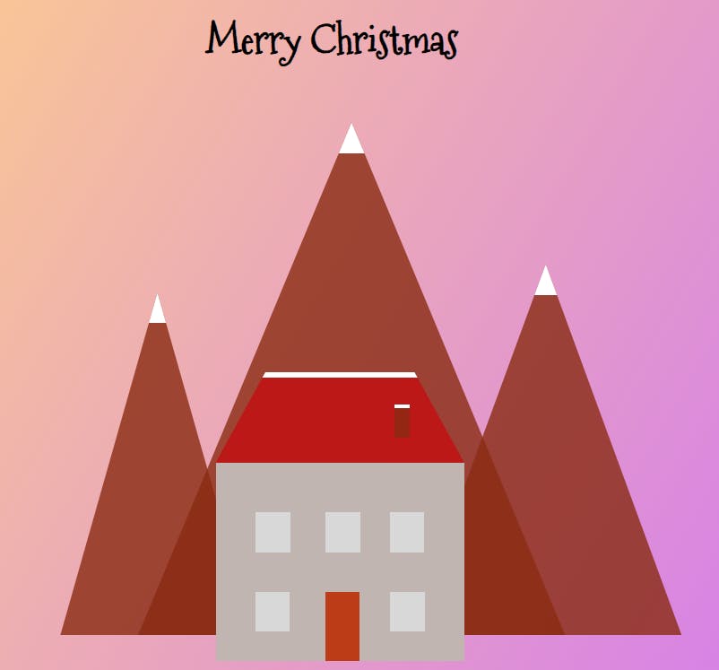
Let's code the roof and the chimney. Both of them are pretty simple, only for the roof I'm going to use the clippy-tool to adjust the shape of it.
.roof{
  position: absolute;
  top: 49%;
  left: 35%;
  width: 32%;
  height: 15%;
  background: $roof;
  border-top: 5px solid white;
 // with clippy tool
  -webkit-clip-path: polygon(20% 0%, 80% 0%, 100% 100%, 0% 100%);
clip-path: polygon(20% 0%, 80% 0%, 100% 100%, 0% 100%);
}

.chimney{
  position: absolute;
  top: 32%;
  left: 72%;
  width: 6%;
  height: 35%;
  background: $mountains;
  border-top: 3px solid white;
}
The result:
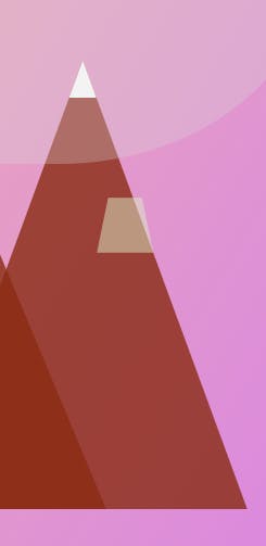
The Sun and the Christmas Tree
We'll need quite a few more classes to define the sun ☀️ and the Christmas tree 🎄.
   <div class="sun"></div>

   <!-- tree -->
   <div class="tree tree-0"></div>
   <div class="tree tree-1"></div>
   <div class="tree tree-2"></div>
   <div class="tree tree-3"></div>
   <div class="tree tree-4"></div>
   <div class="tree tree-5"></div>
   <div class="tree tree-down"></div>
   <div class="tree star"></div>
The SCSS part for the sun is pretty simple.
.sun{
  position: absolute;
  top: -20%;
  left: 42%;
  width: 60%;
  height: 65%;
  background: $sun;
  border-radius: 45%;
}

Ok, now let's do the tree, which is a bit more complicated. I'll have 6 trapezoids (I'm using the clippy-tool), one class for the bottom of the tree and one class for the shiny star).
First, the structure (.tree)
.tree{
  position: absolute;
  height: 8%;
  // clippy-tool
  -webkit-clip-path: polygon(20% 0%, 80% 0%, 100% 100%, 0% 100%);
clip-path: polygon(20% 0%, 80% 0%, 100% 100%, 0% 100%);

    top: 50%;
    left: 79%;
    width: 6%;
    background:rgba(220,237,200 ,0.5);
  }
With this class, you'll only get this:
But let's change it a bit and add each part of the tree (tree-0 to 5)!
.tree{
  position: absolute;
  height: 8%;

  -webkit-clip-path: polygon(20% 0%, 80% 0%, 100% 100%, 0% 100%);
clip-path: polygon(20% 0%, 80% 0%, 100% 100%, 0% 100%);

  &.tree-0{
    top: 50%;
    left: 79%;
    width: 6%;
    background:rgba(220,237,200 ,0.5);
  }
  &.tree-1{
    top: 57%;
    left: 78%;
    width: 8%;
    background:rgba(220,237,200 ,0.6);
  }
  &.tree-2{
    top: 64%;
    left: 77%;
    width: 10%;
    background:rgba(174,213,129 ,0.6);
  }
  &.tree-3{
    top: 71%;
    left: 76%;
    width: 12%;
    background:rgba(139,195,74 ,0.6);
  }
  &.tree-4{
    top: 78%;
    left: 75%;
    width: 14%;
    background:rgba(104,159,56 ,0.6);
  }
  &.tree-5{
    top: 85%;
    left: 74%;
    width: 16%;
    background:rgba(51,105,30 ,0.6);
  }
Amazing, we have a tree! But do you know how we can make it cooler? By adding some animations!
I'll show you how I did it for .tree-0 but it's the same for the other classes too. (Here's the full code.)
&.tree-0{
    top: 50%;
    left: 79%;
    width: 6%;
    background:rgba(220,237,200 ,0.5);

    -webkit-animation: tree-0 3s 1s ease-in-out infinite both;
            animation: tree-0 3s 1s ease-in-out infinite both;
  }

  @-webkit-keyframes tree-0{
  0%,
  50%,
  100% {
    opacity: 1;
  }
  25%,
  75% {
    opacity: 0;
  }
}
@keyframes tree-0{
  0%,
  50%,
  100% {
    opacity: 1;
  }
  25%,
  75% {
    opacity: 0;
  }
}
You now should have a beautiful tree!
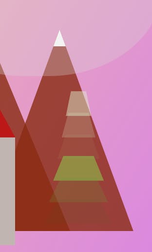
But wait, we talked about the tree's trunk and the shiny star but we didn't code them! Let's do it now. Inside the .tree class I'm going to add:
&.star{
    top: 45%;
    left: 79%;
    width:6%;
    background:$star;

    border-top: 6px solid white;

    //star is it is from the clippy tool
    -webkit-clip-path: polygon(50% 0%, 61% 35%, 98% 35%, 68% 57%, 79% 91%, 50% 70%, 21% 91%, 32% 57%, 2% 35%, 39% 35%);
clip-path: polygon(50% 0%, 61% 35%, 98% 35%, 68% 57%, 79% 91%, 50% 70%, 21% 91%, 32% 57%, 2% 35%, 39% 35%);
  }

// trunk
  &.tree-down{
    top: 92%;
    left: 79%;
    width:6%;
    background:$mountains;
  }
 }
Yes! We finally have a Christmas tree. 🎄
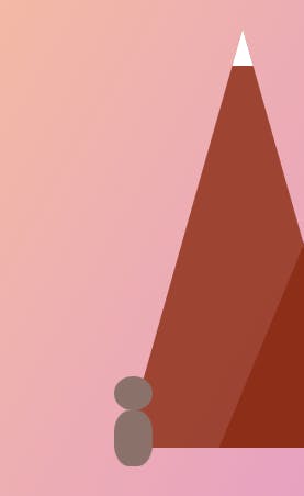
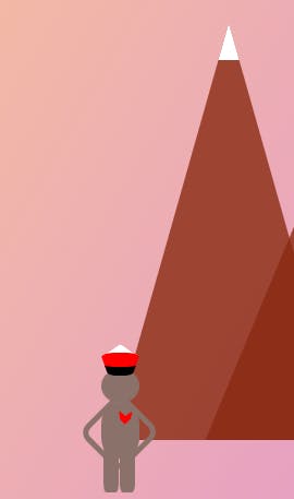
Our Cute Little Human
The last part of this project is going to be a little human with an animated heart. This part could be optimized with fewer classes but I kept it very simple and easy to follow for everyone.
   <!-- little human -->
   <div class="human-head"></div>
   <div class="human-body"></div>
   <div class="heartbeat"></div>
   <div class="human-hands"></div>
   <div class="human-leg-left"></div>
   <div class="human-leg-right"></div>
   <div class="human-cup"></div>
We'll start with the head and the body:
//little-human
.human-head{
  position: absolute;
  top: 85%;
  left: 14%;
  width: 4%;
  height: 5%;
  border-radius: 50%;
  background: $human;
}
.human-body{
  position: absolute;
  top: 90%;
  left: 14%;
  width: 4%;
  height: 8%;
  border-radius: 40%;
  background: $human;
}
Now, let's add the heart and the rest parts of out little guy. (For the heart and the cup I used the tool clippy-path)
.heartbeat{
  position: absolute;
  top: 91%;
  left: 15.5%;
  width: 2%;
  height: 2%;
  border-radius: 40%;
  background: red;
  z-index: 1;
  -webkit-clip-path: polygon(54% 40%, 91% 1%, 81% 60%, 50% 100%, 24% 63%, 19% 0);
clip-path: polygon(54% 40%, 91% 1%, 81% 60%, 50% 100%, 24% 63%, 19% 0);
}

.human-hands{
  position: absolute;
  top: 90%;
  left: 12.8%;
  width: 5%;
  height:7%;
  border-radius: 20%;
  border: 4px solid $human;
  transform: rotate(45deg);
  background: none;
}
.human-leg-left{
  position: absolute;
  top: 96%;
  left: 14.2%;
  width: 1.6%;
  height:7%;
  border-radius: 20%;
  background: $human;
}
.human-leg-right{
  position: absolute;
  top: 96%;
  left: 16%;
  width: 1.6%;
  height:7%;
  border-radius: 20%;
  background: $human;
}

.human-cup{
  position: absolute;
  top: 81.5%;
  left: 14%;
  width: 4%;
  height:2%;
  border-radius: 40%;
  border-top: 6px solid white;
  border-bottom: 6px solid black;
  background: red;
  //penatgon
  -webkit-clip-path: polygon(50% 0%, 100% 38%, 82% 100%, 18% 100%, 0% 38%);
clip-path: polygon(50% 0%, 100% 38%, 82% 100%, 18% 100%, 0% 38%);
}
The last step is to add the animation in the heart(.heartbeat). I call it heartbeat 💗. So let's revisit this class:
.heartbeat{
  position: absolute;
  top: 91%;
  left: 15.5%;
  width: 2%;
  height: 2%;
  border-radius: 40%;
  background: red;
  z-index: 1;
  -webkit-clip-path: polygon(54% 40%, 91% 1%, 81% 60%, 50% 100%, 24% 63%, 19% 0);
clip-path: polygon(54% 40%, 91% 1%, 81% 60%, 50% 100%, 24% 63%, 19% 0);

  -webkit-animation: heartbeat 1.5s ease-in-out infinite both;
            animation: heartbeat 1.5s ease-in-out infinite both;
}
Let's actually add the animation of heartbeat.
@-webkit-keyframes heartbeat  {
  from {
    -webkit-transform: scale(1.1);
            transform: scale(1.1);
    -webkit-transform-origin: center center;
            transform-origin: center center;
    -webkit-animation-timing-function: ease-out;
            animation-timing-function: ease-out;
  }
  10% {
    -webkit-transform: scale(0.91);
            transform: scale(0.91);
    -webkit-animation-timing-function: ease-in;
            animation-timing-function: ease-in;
  }
  17% {
    -webkit-transform: scale(0.98);
            transform: scale(0.98);
    -webkit-animation-timing-function: ease-out;
            animation-timing-function: ease-out;
  }
  33% {
    -webkit-transform: scale(0.87);
            transform: scale(0.87);
    -webkit-animation-timing-function: ease-in;
            animation-timing-function: ease-in;
  }
  45% {
    -webkit-transform: scale(1);
            transform: scale(1);
    -webkit-animation-timing-function: ease-out;
            animation-timing-function: ease-out;
  }
}
@keyframes heartbeat {
  from {
    -webkit-transform: scale(1);
            transform: scale(1);
    -webkit-transform-origin: center center;
            transform-origin: center center;
    -webkit-animation-timing-function: ease-out;
            animation-timing-function: ease-out;
  }
  10% {
    -webkit-transform: scale(0.91);
            transform: scale(0.91);
    -webkit-animation-timing-function: ease-in;
            animation-timing-function: ease-in;
  }
  17% {
    -webkit-transform: scale(0.98);
            transform: scale(0.98);
    -webkit-animation-timing-function: ease-out;
            animation-timing-function: ease-out;
  }
  33% {
    -webkit-transform: scale(0.87);
            transform: scale(0.87);
    -webkit-animation-timing-function: ease-in;
            animation-timing-function: ease-in;
  }
  45% {
    -webkit-transform: scale(1);
            transform: scale(1);
    -webkit-animation-timing-function: ease-out;
            animation-timing-function: ease-out;
  }
}
Omg, we did it:
Here's the full code:
Sum up💫
In this article, I described how to create a Chrismas scene using only SCSS and HTML. We played a lot with shapes, shadows, different positions and animations.
This code is not optimized so feel free to rewrite it on your own and even tag me to see the results. If you have any questions, shoot them below!
Thank you for reading! Find the code on Codepen.
👋 Hello, I'm Eleftheria, Community Manager, developer, public speaker, and content creator.
🥰 If you liked this article consider sharing it.