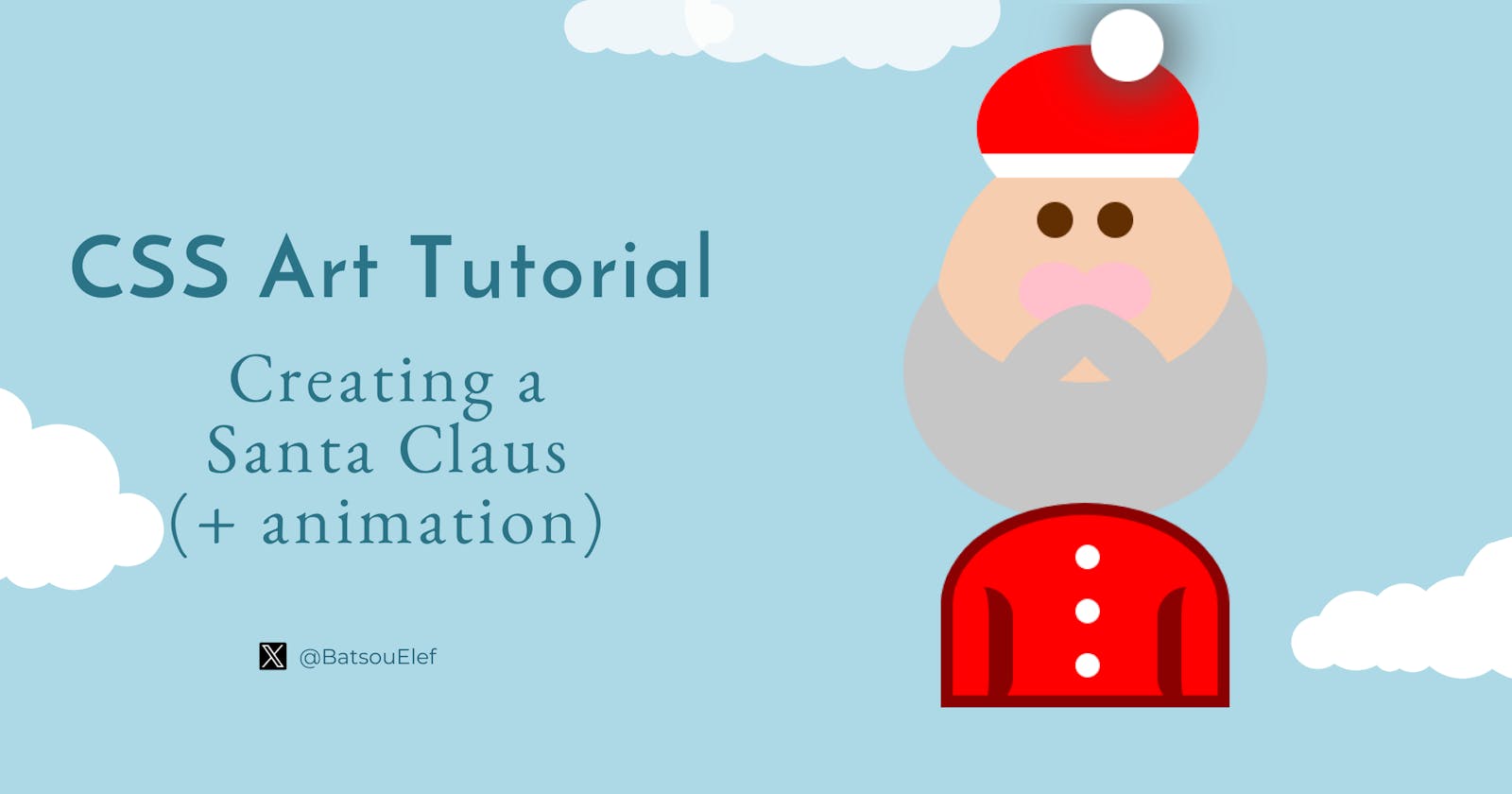
CSS Art Tutorial: Creating a simple Santa Claus (and animate the snowflakes) 🎅❄️
Codepen is inlcuded - Beginners friendly


Introduction
In this article, I'll show you how to create Santa Claus and snowflakes with CSS+HTML. We're going to use a few classes, some pseudo-classes, and in the end we'll add some animation to the snowflakes!
Tools and resources:
I'm using
codepen.CSS box shadow generator ➡️ cssgenerator.org
Clippy, for not your normal shapes ➡️ bennettfeely.com/clippy
You'll learn:
How to create circles
How to write pseudo-classes, and specifically we'll use
::before,::afterHow to add simple animations
For practice, you can:
Add more animations
Complete Santa's body
The final result:
OK, let's start!
The base 🖼️
The HTML code is quite simple.
<div class="container">

</div>
I'll start with creating the background in CSS. To do so, I'll use the body.
/*  CSS Custom Properties */
:root { --bg-color: lightblue }

body  {
  background-color: var(--bg-color);
  height: 100vh;
  display: grid;
  place-items: center;
  margin: 0;
}
Here is what I did:
The first line sets the background color of the entire page to a variable named
--bg-color. Variables in CSS are declared using thevar()function and can be used to store values that will be reused throughout the stylesheet. In this case, the variable is used to set the background color of the entire page.The second line sets the height of the
bodyelement to 100% of the viewport height using thevhunit (1vh is equal to 1% of the height of the viewport).The third line sets the
displayproperty of thebodyelement togrid. This tells the browser to lay out the child elements of thebodyelement as a grid.The fourth line sets the
place-itemsproperty of thegridcontainer tocenter. This tells the browser to align the grid items along the horizontal and vertical center of the grid container.The fifth line sets the margin of the
bodyelement to 0, this will remove any default margin that the browser may have added to the body.
After the body, I have the .container
.container {
  display: flex;
  justify-content: center;
  position: relative;
}
This block of code is a class selector for an element with the class .container.
The first line sets the
displayproperty of the.containerelement toflex. This tells the browser to lay out the child elements of the.containerelement as a flex container.The second line sets the
justify-contentproperty of the flex container tocenter. This tells the browser to align the flex items along the horizontal center of the flex container.The third line sets the
positionproperty of the.containerelement torelative. This allows you to position the container relatively to its initial position, for example, you can usetop,right,bottom,leftproperties to move it around.
Note: body and container are 2 classes I love to use as templates. I usually copy-paste them from previous projects. 😉
Create the head, the beard, and the mustache🫥
Let's start our CSS art by creating a round head.
<div class="container">
  <div class="head">

    <div class="mustache-1"></div>
    <div class="mustache-2"></div>

  </div>
</div>
We will create:
a circle
add color to it
position it relative
.head {
/* create a circle   */
  width: 250px;
  height: 300px;
  border-radius: 50%;
/* add some color so you can see it  */
   background: #f7cdaf; /* beige */

/* we need position relative b/s we're going to have a few elements inside the head.
  The elements will be positioned "absolutely" in releationship with the parent class which is .head */
  position: relative;

/* we also need these 3 lines for the elements that are coming inside the .head (the eyes, cheaks, etc)   */
  justify-content: center;
  display:flex;
  align-items: baseline;
}
After the head, we will add the beard with a pseudo-class. More specifically, we'll use the ::before.
.head::before {
  content: "";
  position: absolute;
  /* add beard   */
  width: 250px;
  height: 200px;
  border-radius: 50%;
  box-shadow: 0px 90px 0px 26px #c6c6c6;
}
This CSS code targets an element with the class of .head, and it uses the ::beforepseudo-element to insert some content before the element (in our case this is going to be the circle and the shadow).
The
content: ""property sets the content of the pseudo-element to an empty string, which means it will not display any content.The
position: absolutesets the position of the pseudo-element to be absolute, which means it will be positioned relative to the nearest positioned ancestor element instead of the viewport.
For the box-shadow I used a box-shadow generator, you can experiment with it here.
Time to add the mustache too!
.mustache-1 {
  position: absolute;
  width: 110px;
  height: 90px;
  background: #c6c6c6;

  margin-bottom: 80px;
  margin-left: 60px;
  align-self: flex-end;
  transform: rotate(40deg);
/* Now I want to hide everything on the top half of the head... (like a mask)
So, I'm using bennettfeely.com/clippy for this */
  clip-path: ellipse(50% 26% at 50% 50%);
}

.mustache-2 {
  position: absolute;
  width: 110px;
  height: 90px;
  background: #c6c6c6;

  margin-bottom: 80px;
  margin-right: 60px;
  align-self: flex-end;
  transform: rotate(-40deg);
  clip-path: ellipse(50% 26% at 50% 50%);
}
These 2 classes (.mustache-1 and .mustache-2) are quite similar and there are ways to write these with fewer lines of code! (An example will follow with the eyes.)
In the above classes, I'm adding the properties transform: rotate(40deg); and transform: rotate(-40deg); to rotate the shapes by 40deg.
Here's what we got so far:

Create the eyes and the cheeks 👀
The HTML part is quite simple. Inside the .head we'll create the .left and .right .eye, and the .cutout (for the cheeks).
<div class="eye left">
    <div class="cutout"></div>
</div>
<div class="eye right">
    <div class="cutout"></div>
</div>
The CSS part, is a bit more interesting! I will start by writing the 2 classes .left and .right.
.left, .right {
  position: absolute;
/* the eyes are centered b/s of the last 3 lines in the .head  */

/* we also need the 3 lines b/s we are going to add the cheeks inside the class .left, .right   */
  display: flex;
  justify-content: center;
  align-items: center;
}
We're going to use ::after to actually create and see the eyes. The eyes are done with a circle and some brown color.
.left::after, .right::after {
  content: "";
  position: absolute;
  top: 50px;
  width: 30px;
  height: 30px;
  background: #622f02; /* brown */
  border-radius: 50%;
}
To separate the eyes, I'm going to add some margin.
.left { margin-left: -50px; }
.right { margin-left: 50px; }
💡Note: You can follow a similar approach for the mustache classes.
I'm pretty happy with the eyes so let's move on to the cheeks!
/* cheeks */
.cutout {
  position: absolute;
  width: 60px;
  height: 50px;
  background: pink;
  border-radius: 50%;
  align-self: flex-end;
  margin-bottom: -150px;
}
Note that for the cheeks (.cutout) we don't need two separate classes and this is because cheeks are inside the .left and .right .eye, so they already have "inherited" a margin.
The head is ready!

Create the hat 🎩
We completed the head! But to be honest our "creature" doesn't look like a Santa Claus. Let's add the red hat and see how it's going to look like.
Inside the .head I'm going to add three new classes (.hat, .hat-belt, .hat-dot).
<div class="head">
    <div class="hat">
        <div class="hat-belt"></div>
    </div>
    <div class="hat-dot"></div>
.
.
.
</div>
I feel that the CSS part is pretty self-explanatory but if you have some questions feel free to ask in the comments section.
I created a white
ellipse(withclip-path) and on top of that I added the.hat-belt(as I'm writing this I'm realizing that the classes' names are not the best but I hope you get the point).Notice that the
.hatand.hat-beltare the samewidthandheightare concerned!
.hat {
  margin-top: -110px;
  width: 280px;
  height: 140px;
  background-color: white;
  clip-path: ellipse(33% 50% at 51% 71%);
}

.hat-belt {
  margin-top: -20px;
  width: 280px;
  height: 140px;
  background-color: red;
}
Now to finish the hat we need one more circle (.hat-dot):
.hat-dot {
  position: absolute;
  margin-top: -110px;
  margin-left: 70px;
  width: 60px;
  height: 60px;
  border-radius: 50%;
  background-color: white;
  box-shadow: 3px 3px 36px 12px rgba(88,88,88,0.75);
}
The only new element is the box-shadow. Feel free to experiment with it, or if you don't like it even remove it.
Here is what we have so far:

Now I feel we're getting closer. Our Santa Claus is almost done.
To make it a little bit cooler I'll add the upper part of his suit. 👕
Create the body
Ok! Just a few more classes for the upper part of his suit (a.k.a the .body). Starting with the HTML, I'm going to add the classes .body, .dot-1, .dot-2, and .dot-3 (the dots are going to be the buttons of the suit).
<div class="body">
    <div class="dot-1"></div>
    <div class="dot-2"></div>
    <div class="dot-3"></div>
</div>
Keep in mind that these classes are not inside the .head, as everything else was.
Ok, here goes the CSS part:
/* Creating the body */
.body {
  position: absolute;
  height: 150px;
  width: 220px;
  background: red;
  top: 300px;
  border: 10px solid darkred;
  border-radius: 100% 100% 100% 100% / 100% 100% 0% 0%;
}
To create a fancy shape (like the body) you can also use this tool.
Now let's create the hands:
/* Preparing the hands.
I'll have 2 hands ~ this code they will be on top of each other*/
.body::before, .body::after {
  content: "";
  position: absolute;
  width: 30px;
  height: 100px;
  top: 60px;
  border-radius: 30px;
}
For the hands, I'm using the ::before and ::after, so I don't need to add any extra classes. These, along with border-radius, will give us what we need!
If you're still following me, you probably know my strategy, first I'll create something and then I'll separate it. With the code above, although we created the "hands" they are on top of each other ~ and you don't have any color, so you can't actually see them. Let's fix that:
/* Let's seperate the hands */
.body::before {
  border-right: 20px solid darkred;
}
.body::after {
  border-left: 20px solid darkred;
  right: 0px;
}
Perfect, now we have the hands. Time to move on to the white buttons:
.dot-1, .dot-2, .dot-3 {
  margin-left: 102px;
  margin-top: 25px;
  width: 20px;
  height: 20px;
  border-radius: 50%;
  background-color: white;
}
Yes! Our Santa Claus is ready! 🧑🎄

Create the snowflakes & add animation ❄️
The last, and optional step is to create a few snowflakes in the background and add some animation to them.
Starting with the HTML, we need one more class, the bg.
<div class="container">
  <div class="bg"></div>

    .
    .
    .
    .
</div>
For the snowflakes, I'll add a round shape but with 4 shadows, this will give me the effect of the snow! (Of course, you can be more creative and create real snowflakes.)
.bg {
  width: 50px;
  height: 50px;
  position: absolute;
  left: -100px;
  border-radius: 50%;
  top: 20px;

/* adding the 4 snowballs (as shadows)   */
  box-shadow:
    400px 60px 0 0 rgba(0,0,0,.15),
    50px 150px 0 0 rgba(0,0,0,.15),
    20px 30px 0 0 rgba(0,0,0,.15),
    370px 180px 0 0 rgba(0,0,0,.15);

/* Let's animate them   */
  animation: bgAnim 3s infinite alternate;
}
For the animation I chose to have a duration of 3s forever (infinite) and alternate (go up and down).
Let's write the class (bgAnim) that will change the location and the color of the snowflakes (box-shadow).
@keyframes bgAnim {
  from {
    box-shadow:
      400px 60px 0 0 rgba(0,0,0,.15),
      50px 150px 0 0 rgba(0,0,0,.15),
      20px 30px 0 0 rgba(0,0,0,.15),
      370px 180px 0 0 rgba(0,0,0,.15);
  }
  to {
    box-shadow:
      400px 180px 0 0 rgba(0,0,0,0),
      50px 250px 0 0 rgba(0,0,0,0),
      20px 130px 0 0 rgba(0,0,0,0),
      370px 290px 0 0 rgba(0,0,0,0);
  }
}
We're officially done!
Sum up💫
In this article, I described how to create a Santa Claus using only CSS and HTML. More specifically, we created the head and body with a few classes and pseudo-classes. We used the pseudo-classes ::before and ::after to achieve things such as the beard, the hands, etc. Many of Santa's characteristics, such as the hat, have been created with inner or outer shadows. Last but not least, there is an animation (created with shadows) for the snowflakes.
If you have any questions feel free to ask them in the comments!
Before you start creating something similar, it'd be good to know how:
positions work (mainly position absolute, relative)
some basic flex-box properties work
to play around with
box-shadowto use the
::beforeand::afterExtra: animations
Feel free to tag me if you try something similar. I'd love to see your art!
Thank you for reading! Find the code on Codepen.
👋 Hello, I'm Eleftheria, Community Manager, developer, public speaker, and content creator.
🥰 If you liked this article consider sharing it.