

Introduction
This article delves into two powerful CSS3 features: Box Shadows and Border Radius. We'll explore their roles in enhancing UI design, starting with an understanding of CSS3, its evolution, and the significance of these two features in crafting modern, visually appealing interfaces.
Throughout this article, you'll find practical coding examples and advanced techniques for using Box Shadows and Border Radius. We'll also discuss how to combine these elements to create more complex designs, like a card UI element. Let's dive in!
Understanding Box Shadows (+ Examples)
CSS3 Box Shadows are used to apply a shadow effect to an element. The syntax for Box Shadows is as follows:
box-shadow: horizontal-offset vertical-offset blur-radius spread-radius color inset;
horizontal-offsetspecifies the horizontal distance where the shadow will be placed. A negative value places the shadow to the left of the box.vertical-offsetspecifies the vertical distance of the shadow. A negative value places the shadow above the box.blur-radiusis optional and defines the blur radius of the shadow. The larger the value, the bigger and lighter the shadow becomes.spread-radiusis also optional and indicates the size of the shadow. Positive values will cause the shadow to expand and grow bigger, negative values will cause the shadow to shrink.colordefines the color of the shadow.insetis an optional value that, if specified, changes the shadow from an outer shadow (outset) to an inner shadow.
Simple Example
Here is a simple example of a box shadow:
div {
  box-shadow: 10px 10px 5px 0px rgba(0,0,0,0.75);
}
In this example, the box shadow is offset 10 pixels to the right and 10 pixels down, with a blur radius of 5 pixels and no spread. The color of the shadow is black with 75% opacity.
💡Note: Vendor prefixes like -webkit-, -moz-, -ms-, -o- can be used to ensure compatibility across different browsers.
Advanced Techniques with Box Shadows
Advanced techniques can include manipulating the blur and spread radius to create different shadow effects, using color to enhance the perception of depth, or using multiple shadows to create complex effects.
Multiple Box Shadows
CSS3 allows you to specify multiple box shadows by comma-separating the values. This can be used to create a layered shadow effect, which can give the illusion of depth and make the element appear more three-dimensional.
For example:
box-shadow: 3px 3px 5px 6px #ccc, 5px 5px 10px 10px #000;
In this example, there are two shadows applied to the box. The first is a lighter shadow, offset 3px to the right and down, with a light gray color. The second is a darker shadow, offset 5px to the right and down, with a black color. The combination of these shadows gives a layered effect.
Inset Box Shadows
The inset keyword allows you to create an inner shadow, i.e., a shadow that is inside the border of the box. This can be used to create an embossed effect, making the box appear as if it's been pressed into the page.
For example:
box-shadow: inset 5px 5px 10px 5px #000;
In this example, the shadow is inside the box, offset 5px to the right and down, with a black color. This gives the impression that the box is pressed into the page.
More Examples
Multiple Box Shadows
As mentioned above, you can apply multiple shadows to an element using commas to separate each shadow. Each shadow is described by 2-4 length values, an optional color, and an optional inset keyword.
HTML:
<div class="multiple-shadows"></div>
CSS:
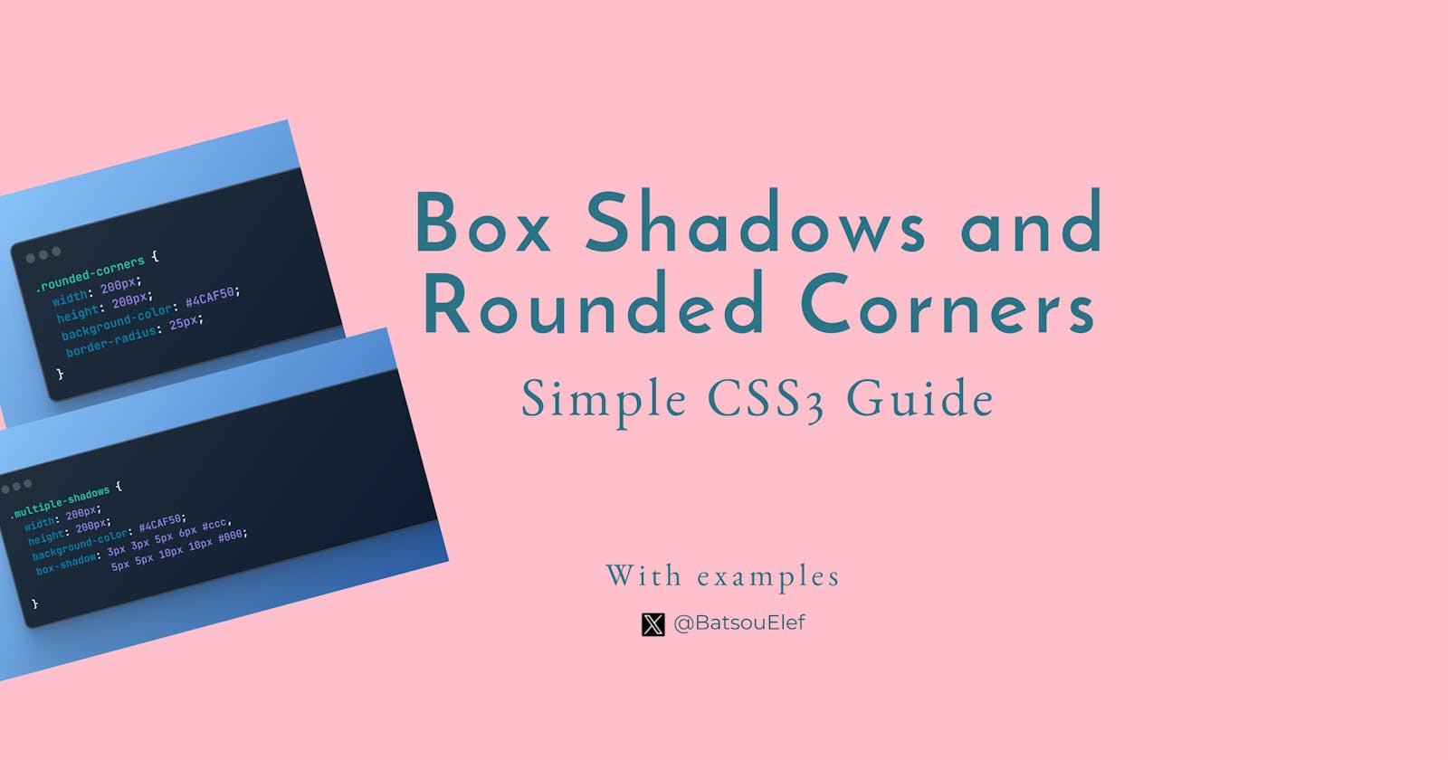
.multiple-shadows {
  width: 200px;
  height: 200px;
  background-color: #4CAF50;
  box-shadow: 3px 3px 5px 6px #ccc,
              5px 5px 10px 10px #000;
}
In this example, the .multiple-shadows class has two shadows. The first shadow is offset 3px to the right and 3px down, with a blur radius of 5px, a spread of 6px, and a color of light gray. The second shadow is offset 5px to the right and 5px down, with a blur radius of 10px, a spread of 10px, and a color of black.
Inset Box Shadows
The inset keyword, if present, changes the drop shadow from an outer shadow (one that casts a shadow as if the box were raised above the content behind it) to an inner shadow (one that casts a shadow as if the content behind the box is raised above the box itself).
HTML:
<div class="inset-shadow"></div>
CSS:
.inset-shadow {
  width: 200px;
  height: 200px;
  background-color: #4CAF50;
  box-shadow: inset 5px 5px 10px 5px #000;
}
In this example, the .inset-shadow class has an inner shadow that is offset 5px to the right and 5px down, with a blur radius of 10px, a spread of 5px, and a color of black.
Understanding Border Radius (+ Examples)
The border-radius property in CSS3 is used to add rounded borders to an element. The syntax for border-radius is as follows:
border-radius: [value1] [value2] [value3] [value4];
Each value corresponds to a corner of the box, starting from top-left and moving clockwise. The values can be specified in pixels (px), em, percentages (%), etc.
If only one value is specified, it applies to all corners. If two values are specified, the first applies to top-left and bottom-right corners, and the second to top-right and bottom-left corners. If three values are specified, the first applies to the top-left, the second to top-right and bottom-left, and the third to the bottom-right. If all four values are specified, they apply to the top-left, top-right, bottom-right, and bottom-left corners, respectively.
Practical Example
Creating rounded corners with Border Radius
Here is an example of how to create a box with rounded corners using the border-radius property:
HTML:
<div class="rounded-corners"></div>
CSS:
.rounded-corners {
  width: 200px;
  height: 200px;
  background-color: #4CAF50;
  border-radius: 25px;
}
In this example, the .rounded-corners class creates a box with a 25px radius on all corners, resulting in rounded corners. The background color of the box is set to a green color (#4CAF50).
Advanced Techniques with Border Radius
The border-radius property in CSS3 is not just for creating rounded corners. It can also be used to create more complex shapes such as circles and ellipses.
Creating Circular Elements
You can create a circle by setting the border-radius to 50%. This works because the border-radius property can take percentage values, and a value of 50% will create a perfectly round corner that forms a circle.
Here's an example of how you can create a circular element:
<div class="circle"></div>
.circle {
  width: 100px;
  height: 100px;
  background-color: #4CAF50;
  border-radius: 50%;
}
In this example, the .circle class creates a box with a 50% border radius on all corners, resulting in a circular shape. The background color of the circle is set to a green color (#4CAF50).
Creating Elliptical Elements
You can create an ellipse by setting different border-radius values for the horizontal and vertical axes.
Here's an example of how you can create an elliptical element:
<div class="ellipse"></div>
.ellipse {
  width: 200px;
  height: 100px;
  background-color: #4CAF50;
  border-radius: 50%;
}
In this example, the .ellipse class creates a box with a 50% border radius on all corners, resulting in an elliptical shape. The background color of the ellipse is set to a green color (#4CAF50).
Practical Example
Creating Complex Shapes with Border Radius
You can create more complex shapes by specifying different values for each corner's border-radius.
Here's an example of how you can create a complex shape:
<div class="complex-shape"></div>
.complex-shape {
  width: 200px;
  height: 200px;
  background-color: #4CAF50;
  border-radius: 50% 20% 30% 40%;
}
In this example, the .complex-shape class creates a box with different border radius values for each corner, resulting in a complex shape. The background color of the shape is set to a green color (#4CAF50).
Combining Box Shadows and Border Radius
The combination of box shadows and border-radius can be used to create various UI elements, such as cards, which are commonly used in web design. Let's look at a practical example of creating a card UI element with box shadows and border-radius.
<div class="card">
  <h2>Card Title</h2>
  <p>Card content goes here...</p>
</div>
.card {
  width: 300px;
  padding: 20px;
  box-shadow: 0 4px 8px 0 rgba(0, 0, 0, 0.2),
              0 6px 20px 0 rgba(0, 0, 0, 0.19);
  border-radius: 10px;
  background-color: #ffffff;
}
In this example, the .card class creates a box with a width of 300px and a padding of 20px. The box-shadow property is used to apply two shadows, creating a subtle 3D effect. The border-radius property is set to 10px, giving the box rounded corners. The background-color of the card is set to white.
This combination of box shadows and border radius results in a card that has a modern, clean look and feel. It appears to float above the page, thanks to the box shadows, and the rounded corners soften the overall appearance of the element.
3 Box Shadow and Border Radius Generator Tools
And because it's not always easy to create your own CSS style, here are some free box shadow and border radius generator tools:
CSS Matic: This is a comprehensive tool that not only generates box shadows but also other CSS effects like gradients and border radius. It provides a visual interface for adjusting the shadow properties and generates the CSS code.
CSS3 Generator: Similar to CSS Matic, CSS3 Generator allows you to create a variety of CSS effects.
Enjoy CSS: This is a more advanced CSS3 generator that allows you to create complex designs and generates the corresponding code. You can create box shadows, border radius as well as text shadows, transitions, transformations, and more.
Conclusion
In conclusion, CSS3's Box Shadows and Border Radius are powerful tools that significantly enhance UI design.
Box Shadows add depth to elements, creating a three-dimensional effect that can make your UI elements more visually appealing and intuitive. It allows for the creation of simple to complex shadow effects, including multiple and inset shadows.
On the other hand, the Border Radius property is instrumental in creating rounded corners, contributing to a softer and more modern look. Beyond that, it can be used to create complex shapes, including circles and ellipses, adding a unique touch to your design.
When combined, Box Shadows and Border Radius can be used to create sophisticated UI elements. These two features, therefore, play a crucial role in crafting modern, visually appealing interfaces.
👋 Hello, I'm Eleftheria, Community Manager, developer, public speaker, and content creator.
🥰 If you liked this article, consider sharing it.