The most common UX/UI problems on portfolios (and how to fix them, with real solutions)
Here are the most common UX/UI problems on portfolios (and how to fix them)
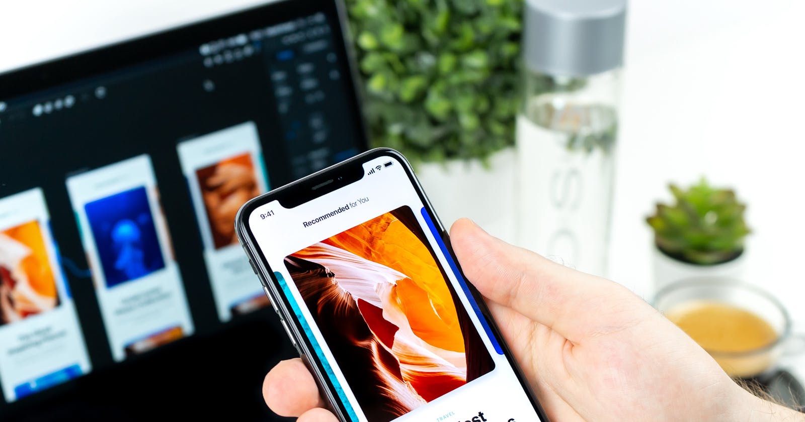
Photo by Daniel Korpai on Unsplash
I recently reviewed 21 websites/portfolios from people all over the world. To my surprise, there were some common ‘mistakes’ in which the solutions are pretty simple.
(Watch here the video reviews.)
🎨Too many colors
This is one of the most common mistakes. Don’t get too excited and don’t use too many colors unless you are 100% sure that you are using them correctly. Here is a video with a list of color tools to help you choose the right color scheme for your project.
If you feel more comfortable with colors and you want to experiment with something different then I’d suggest gradient colors. They will make your website feel unique and more modern :)
🖌Low color contrast
One more common mistake is having two shades of the same color, one as the background and one as the font-color. This approach will make your text harder to be read and we don’t want that.
Stick to colors that have high contrast between them. Maybe the next video will help :)
Also, when choosing colors think about different occasions, like:
- is the text a link, is the link hovered? is the link visited?
- does the color change between headings and sub-headings?
- when you want to emphasize something, do you make it bold? and if so, how bold? do you even change the color?!
🧐Typography: too hard to be read
The typography should follow the same rules as the colors: you don’t want too many font-families and you don’t want font-families that are difficult to be read.
A lot of people, unfortunately, don’t understand how important typography is.
Stick to simplicity. Play between 1 to 2 font families, pick one for the headings and one for the main text. Choose the appropriate style.
In general, you want simple font styles that are easy to be read. It’s nice to be creative but this is not the right place to show that. And from the other hand, don’t go with the default ones that are coming from your browser. Your browser’s font styles are good, but if you use them it will make you seem a bit amateur and we don’t want that.
One of my biggest suggestion would be to read the fundamentals of typography before choosing a font family.
🎎To have an image or not to have an image?!
Use images where you have to, and don’t use them if they don’t offer anything to the viewer/reader.
If you have an article you usually want to have an image. That’s cool! But add an appropriate image, something that has to do with your article. If it’s something too technical maybe it’s difficult to find a good image, but I hope the next video will help you with that.
Oh, and don’t forget that you want high-resolution images
There is also another case that I saw a lot of people had a hard time: when you have both an image and above that some text (probably a title). If the image is colorful then the text is going to be hard to be read. In those cases choose simple images with maybe only a few colors, or even black and white.
You can also edit the original photos to make them look a bit faded so the text can be read easier. This will also make your images unique.
🙂The use of icons
In general, you want icons. The most common cases you want them is for your social media links and other small details. One of those small but important details is the favicon! At least 50%, of the people I reviewed their websites, were using the default one (which is usually the logo of a framework or a website builder). If you do that it makes you look a bit unprofessional ← and we don’t want that.
These were the common findings.
Do you have a site you want me to review for free?
Take part here (I only need a URL and your name).
🤓The process: 1. Every week I do a live stream on my youtube channel reviewing a site 2. I will give feedback and suggestions according to your needs. 3. If you share a way to contact you, I’ll gladly do so :) 4. If you have any questions don’t hesitate to contact me!
- It doesn’t matter if you are a beginner or more advanced.
- You can submit as many sites as you want.
🙏Thank you for taking part with your website into my live streams. It takes courage to let someone you don’t know review your work… But remember feedback is important and all of us need it…
🤗The review is FREE. You don’t pay for anything. I won’t be paid by anyone
👋Hello, I'm Eleftheria, a front-end developer, master student, freelancer, public speaker, and chocolate lover.
🥰If you liked this post please share
🍩Would you care about buying me a coffee? You can do it here: paypal.me/eleftheriabatsou but If you can't that's ok too!
🙏It would be nice to subscribe to my Youtube channel. It’s free and it helps to create more content.
